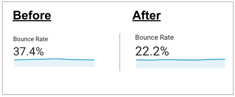
5 steps that decreased our bounce rate by a huge 41%
By Neal Taparia - Last Updated: 09/27/2023

When my mother in law told me the solitaire game she loved was no longer online, my friend and I thought that it might be a fun project to launch our own site. We had previously built a consumer business that reached 30M students yearly, and thought solitaire could be a fun playground to learn about gaming and even tie in and test concepts like mental stress and cognition.
We launched our free online solitaire game, and soon after launched other popular variations like spider solitaire and freecell.
As users came in, we saw that our bounce rate averaged around 37%. “Not bad,” we thought. Most content sites had much higher bounce rates, and our past businesses that were optimized had bounce rates in that range. When we studied other gaming sites though using Similar Web, we saw that they had lower bounce rates. What if we can achieve something similar or better?
1. Investigating browser issues: moving from 37% to 34%
From past experience, we know getting our site to work across Chrome, Firefox, Edge, and Safari is no easy feat. Each browser has its nuances, and even if our solitaire game works smoothly on one browser, it doesn’t mean it will work smoothly on others.
Having quickly launched our solitaire site, MVP style, we hypothesized this may be a good place to look based on past experience.
Low and behold, we saw that Safari had a terrible 56% bounce rate.
When we loaded the game in the browser, we noticed that upon clicking the cards, they sometimes did not move as expected. It was a major bug!
We also saw that IE Explorer had an even worse bounce rate of 73%.
With IE Explorer being less than 1% of our traffic and being phased out for Edge, we decided not to invest our time there, and instead fix the Safari bug.
The result: bounce rate decreased by 8%, and dropped to an average of 34%!
2. Optimizing mobile responsiveness: moving from 34% to 30%

We saw in our data that mobile users represented approximately 20% of our user base, so we knew that was a segment we needed to pay attention to.
When we looked at our mobile bounce rate in Google Analytics, it was well above our new average of 34%, hovering at 51%. That was clearly an issue.
We first saw in our vertical orientation on mobile that the cards were almost illegible. When we increased the size, mobile bounce rate improved meaningfully to 40%.
Still though, the cards were small because they were limited by the length of the phone in vertical orientation.
What if we optimized our horizontal orientation?
First, we made sure that when tilted horizontally, the cards would take up the entire screen, making the card interaction easier. Then, we created a graphic to encourage uses in vertical orientation to try horizontal orientation for a better experience.
The result: overall bounce rate dropped to 30%!
3. Changing the card back: moving from 30% to 28%

In our support center, a user asked if we could offer a better design for our card back. We reached out to this user, and asked why.
She said that our current design looked pixelated and didn’t contract well with the green felt. Instead, a red card back that looked like a real card could be better, and indicate that our site was a high quality one. It was one of those insights where you kick yourself and say “duh.”
To be sure, we ran a user survey via hotjar showing a new card design. 71% of respondents said they preferred our current red card back on the site.
After making this change and our bounce rate decreased to an average of 28%
4. Adding important functionality and reducing bounce rate to 26%

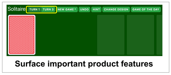
In classic solitaire, there are two popular forms of games played. One is where you turn 1 card at a time over from the stockpile, and another where you turn 3 cards over from the stockpile.
We default to turn 1, but only in our all games menu did we link to the turn 3 options.
We hypothesized that many of our users wanted a turn 3 option, and may have been bouncing when they didn’t see that immediately available. We ran a quick user survey via HotJar and which confirmed this, giving us confidence it’s worth adding this to the game. We added a tab that allows you to flip between modes.
Not only did we see turn 3 solitaire play increase materially, but we further reduced our bounce rate to 26%. What’s interesting is our users did not naturally write in saying they couldn’t find turn 3. Those users who were looking for it likely just naturally bounced. We had to research and hypothesize to unearth this.
5. Leveraging data to drop the bounce rate to 22%

Once we added Google event tracking to all our buttons, we were able to get insights into what features were most engaged, and it was eye opening.
It turned out that the hint button was a popular feature. In retrospect, it made sense. It’s easy to get stuck in solitaire, and undoing is the only way to get you back on track.
We found that after the new game and undo feature, this was the next most popular one, with 20% of our audience clicking it.
However, the hint was on the far right of our navigation. Knowing that internet users look at websites in an F-shaped pattern, this meant that some users who might be new to solitaire might not even notice this feature. If they don’t know how to play, the hint feature is critical to getting them started.
We moved the hint button right after the undo button, closer to the left of the screen. We not only did this increase clicks on it by 25%, we reduced our bounce rate to 22%. Users who had to brush up on how to play solitaire suddenly had an easy way to do that.
6. Improving card design to reduce bounce by 10% in ours Hearts game
Recently we launched a new game, Hearts. A user wrote in saying they had a hard time seeing the cards. To address this, our designer redesigned the cards to move away from a traditional playin card design and instead emphasize the number and suit. By making it easier to see cards the number and suit, we found that it reduced bounce rate to the game by 10%.
7. Leveraging video to increase stickyness by another 10%+
We found that many of our users either don't know how to play solitaire or don't know basic strategy to play the game. Given that video is a great form of engagement, we launched a video player in our right rail that teaches strategy and how to play. As a result, we found that more users were able to complete their first game, our bounce rate dropped more, and more importantly our overall engagement and games played per user increased by over 10%!
You can always improve user experience.
Focusing on bounce rate is a great place to start when improving your site. Improving your bounce rate is the rising tide that lifts all business KPIs. We made similar improvements to our Klondike and Mahjong games and overnight we saw improved engagement.
Start collecting data and try user tracking tools like HotJar to understand where there are opportunities to improve. You’ll be surprised by how much you can improve.
And if you're getting the itch to learn how to play solitaire after reading this, check out our how to play guide.
About the author

